Your website is one of your most important assets. It is not just a place to showcase your products and services to drive conversions. A well-designed website is a reflection of everything your brand stands for. It helps you build a strong online presence on the search engines and on social media platforms.
There are many factors you need to keep in mind while designing your website. These can have an impact on the overall usability of your website. One such critical aspect is website navigation. A website with poor navigation is perceived as unprofessional and unusable.
Before we discuss some of the most common website navigation mistakes, let's take a look at why it is so important.
Table of Contents
Website Navigation: Understanding Its Importance
Would you go on a trek without a compass and a map? Without these objects, you’d be lost in the woods, trying to figure out which direction you should head towards.
Similarly, website navigation is like a map that guides users to different areas on your website. In its absence, website visitors may feel lost and end up abandoning your website within seconds.
So, easy website navigation makes your website more engaging, thereby reducing your bounce rate. Users are more likely to find the information that they were looking for in the first place. This, in turn, helps to increase conversions, which is one of the primary objectives of your website.
Website navigation also influences your search engine rankings. A proper navigation system makes it easy for search engine robots to crawl through your website and index different web pages.
Improved search engine ranking, in turn, increases organic traffic to your website. This is crucial in order to drive more conversions.
Without a proper website navigation system, even the most creatively designed website won’t help you meet your objectives. Despite this, website developers often ignore its importance, ultimately affecting the overall usability of a website.
Now, let's take a look at some of the most common website navigation mistakes.
1. Going Against Convention
Due to the growing popularity of websites in general, certain unsaid regulations have come to be associated with website navigation.
For instance, visitors are used to seeing a horizontal navigation bar on top or a vertical one on the left side of a web page. Placing the navigation bar elsewhere makes it difficult for visitors to move through your website. As a result, you may encounter high bounce rates and minimal conversions.
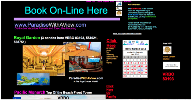
Take a look at the screenshot below to understand exactly what kind of website navigation style you should avoid.
Image via ParadiseWithAView
The homepage clearly lacks a proper navigation bar and a search box. It is very difficult to tell what the company is all about. As a visitor, you will also be clueless about what actions to take on this web page.
Your marketing strategy surely depends on your ability to surprise your target audience with unexpected campaigns. However, website navigation is not the right place to exhibit your creativity.
Car manufacturers don’t experiment with the position of the steering wheel or the brake pedal. Similarly, you shouldn’t play around with the navigation bar. In addition, the navigation style should be consistent across all web pages.
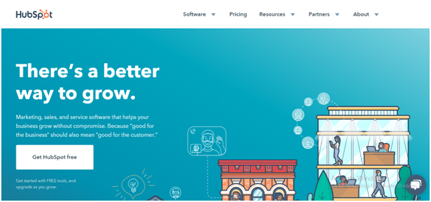
The homepage of the HubSpot website has a navigation bar located towards the top right. This makes it easy for visitors to locate relevant information on the website.
Image via HubSpot
The bar stays in the same position on every page of the website. Such a standardized website navigation system greatly enhances usability.
2. Using Drop-Down Menus
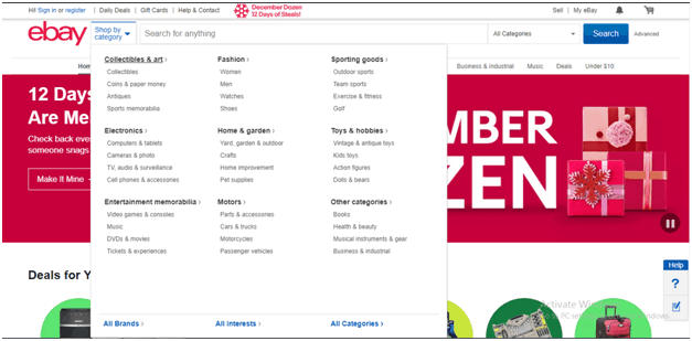
You may come across websites that use drop-down menus. They help you group different menu items under one heading. However, despite their popularity, there is a downside to using drop-down menus. They are often perceived as annoying by website visitors.
Image via Optimus01
The main reason is that website visitors usually move their eyes much faster than they move their mouse. By the time they get the mouse to a menu item, they have already made up their mind to click on it.
A drop-down menu hinders the seamless experience that the visitor was expecting. Instead, it bombards them with more options, which can be annoying.
In addition, drop-down menus also make it difficult for search engine robots to crawl through your website. The only scenario when a drop-down menu is advisable is when you have a plethora of options to offer on your website navigation bar.
For instance, such menus work best for ecommerce websites that have to list products under various categories.
Image via eBay
3. Using Non-Specific Labels
One of the main purposes of having a website is to communicate with your target audience. Generic labels such as “products” and “services” don’t convey vital information about your business.
So, your website navigation needs to be descriptive and self-explanatory. Such labels immediately tell visitors what they can expect from your business and whether it is relevant to them.
In addition, specific labels also indicate your relevance to search engines. So, it’s a clever strategy to use Google’s Keyword Planner tool to name your navigation bar labels.
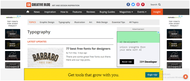
Take a look at the screenshot below to see how the website uses descriptive labels. It instantly communicates where each menu item is likely to take the visitors.
Image via Creative Bloq
In addition to being descriptive, these labels are concise and easy to read. Comprehensive labels prevent your navigation bar from appearing cluttered.
4. Offering Too Many Options
Bombarding your website visitors with numerous links on your homepage confuses them. They may not be able to spot the information they were looking for in the first place.
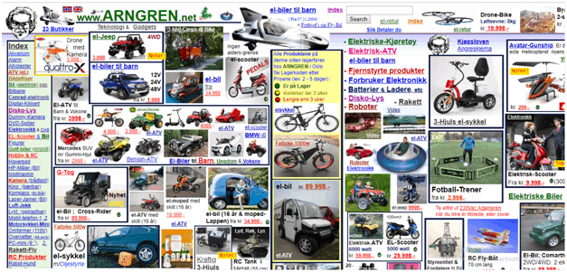
They may also ignore key information that you want to communicate. The screenshot below exhibits how cluttering your homepage with countless links is a huge mistake.
Image via Arngren
According to a report published by cognitive psychologist, George A. Miller, the human mind is capable of storing only 7 items in short-term memory.
So, it is recommended to keep the number of menu items on your homepage below 7. This will help you highlight the most important aspects of your business. It also becomes easier for visitors to locate relevant information.
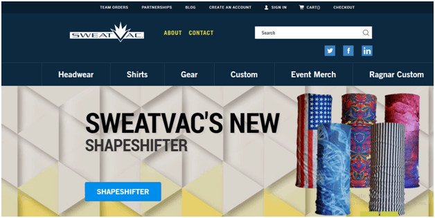
Image via SweatVac
In the above example, the website uses only six menu items on the website navigation bar. This immediately tells users what they can expect from the brand. It is also noteworthy how the website incorporates self-explanatory labels to highlight the company’s core products.
5. Wrong Order of Website Navigation
German psychologist, Hermann Ebbinghaus, conducted a series of experiments on human memory. His research revealed that the human mind is more likely to remember items placed at the beginning or end of a list. This theory is also applicable to website navigation.
So, it is advisable to place the most important and frequently accessed items at the extreme ends of the navigation bar. Vital information such as “Contact Us” or “Log In” is usually placed towards the top right of a website’s homepage. This saves visitors the trouble of scanning through the entire menu to spot key details.
Image via PayPal
6. Non-Responsive Website Navigation
According to Statista, the global web traffic from mobile devices rose to 52.4% in the third quarter of 2018. This indicates that your potential customers are likely to access your website from different devices with varying screen sizes.
So it is important that your website navigation is responsive to different screen dimensions. Otherwise, you may lose out on a lot of website traffic that might come from mobile devices.
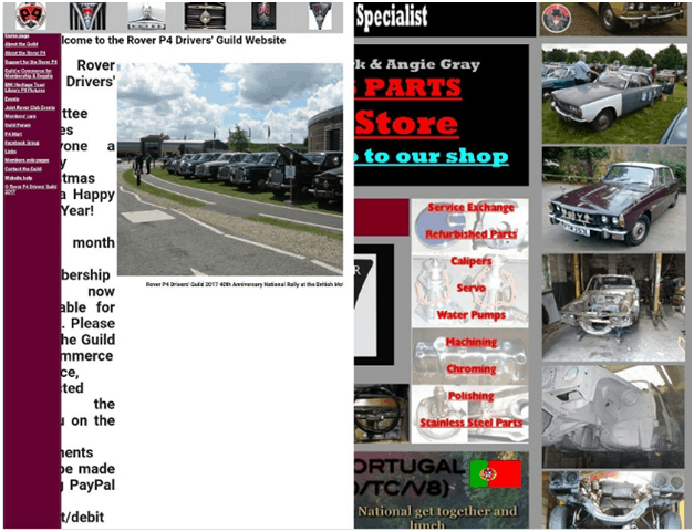
Here’s an example of a website that isn’t responsive to mobile devices.
Image via RoverP6
7. Dead Ends
No one likes to reach a web page from where they can’t access other parts of your website. If this happens, a visitor is likely to perceive your website as unprofessional and cumbersome to use. This is a website navigation mistake that you don’t want to make.
Such instances include under-construction pages and those containing only images. The best practice is to include only fully-developed pages that give the option of navigating to other web pages when required.
It is also essential to use self-explanatory headings to tell visitors exactly where they are on your website. This is especially important for people who land up on your website through social media or search engines. It helps them find their way through your website and locate the necessary information.
In the absence of such clarity, visitors are likely to exit your website without taking any action.
8. Using Button-Based Navigation
Buttons often take more time to load, resulting in poor visitor engagement. In addition, they are invisible to search engines. Clearly, buttons don’t enhance website navigation. So, it is advisable to replace them with text-based links.
Image via LYFE Marketing
9. Showing a False Bottom
While scrolling, if it’s not obvious to a user that there is more website content beyond a point on your page, you’ve got a problem. Users are likely to stop scrolling or abandon the page in such an instance.
That’s what you call a “false bottom.” It gives the illusion that a user has reached the end of a page.
Because of this, users may have a hard time finding what they need on your website. It’s an issue that’s indirectly related to website navigation.
Here are some reasons why you could be facing a false bottom issue:
Using Large Images on Your Web Pages
Graphics or images that fill an entire page could wreak havoc for your website navigation. They can hog all the space above-the fold or even push down other important elements of your page. This can be a big problem if your calls-to-action are misplaced.
Additionally, users might also think that the end of the image is actually the end of the page. That’s why it’s advisable to resize your images. If you really need to fill your web pages with many graphics or images, give a directional cue. That’s the best way to avoid a big website navigation mistake.
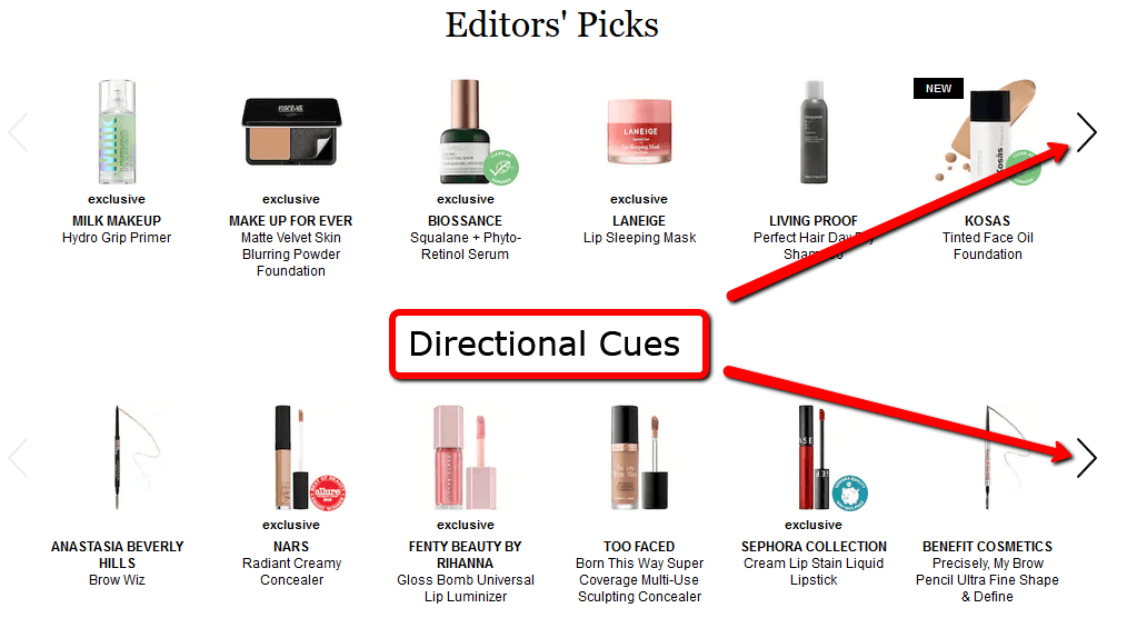
For instance, check out how Sephora uses directional cues in the Editor’s Picks section.
Image via Sephora
You can also use these kind of arrows to indicate to users to scroll down in a page. It’s a great way to get your website navigation more organized and lead the audience to the next section of the page.
Adding Horizontal Bands
While horizontal bands are great to differentiate a section, it can also look like you’ve reached a dead end. This is especially true in cases where horizontal bands span the entire width of a web page.
In general, a horizontal partition can be perceived as a stop sign. So, instead of seeing it as a separate section, a user might think they reached the end of the section.
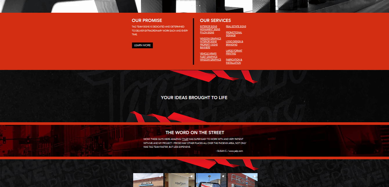
Tag Team Signs has been a victim of this common website navigation mistake. If you look at the screenshot below, you’ll notice there are columns of pictures at the end of the page. But because horizontal bands are used above it, a scrolling user may think the section has ended right there.
Image via TagTeamSigns
Using Too Much Negative Space
Generally, negative space is used to enhance a page and emphasize a part of it. But if you use too much negative space, it can seem like there is nothing to see on the page. The emptiness can meddle with website navigation.
Just like with horizontal bands, even with negative space, it’s easy to get confused. Users may think they have reached the end of the page if there is too much space at the bottom.
If you see such a page on a smaller screen, the problem gets worse. The gap between various elements on the page only increases. So, it becomes hard to discover content. In turn, it affects how effective your website navigation is.
Final Thoughts
Navigation is critical to the success of your website. Your navigation system can make or break the user experience. Proper website navigation is perceived as a sign of professionalism. This can go a long way to establish your brand's image.
Website designers and programmers should create a user-friendly navigation system to provide a better user experience. Visitors shouldn’t be left on their own to figure out where they are or how your website works. A text-based navigation bar with concise and descriptive labels is extremely useful. You must also make sure that you don't present your visitors with a flood of choices.
Did I miss any other common website navigation mistakes? Share your views in the comments section below.







![digital marketing for startups: the strategies to use in [year] 29 best digital marketing strategies for startups](https://wordpress-890923-3114958.cloudwaysapps.com/wp-content/uploads/2021/09/best-digital-marketing-strategies-for-startups.png)

This is an incredibly good post. You have really spent a lot of effort to generate this great article. Thank you.
Thanks for sharing effective tips for digital marketing. Digital marketing always an important factor in promoting a business online.