Do you agree that the goal of all ecommerce businesses is to get more leads and drive more conversions?
For this, it’s essential to grab the attention of your website visitors. After you get their attention, you need to persuade them to purchase your product.
But, you know what?
Getting your visitors to take action can be a tricky task. If you’re struggling to generate leads, you should consider optimizing your ecommerce landing page.
Table of Contents
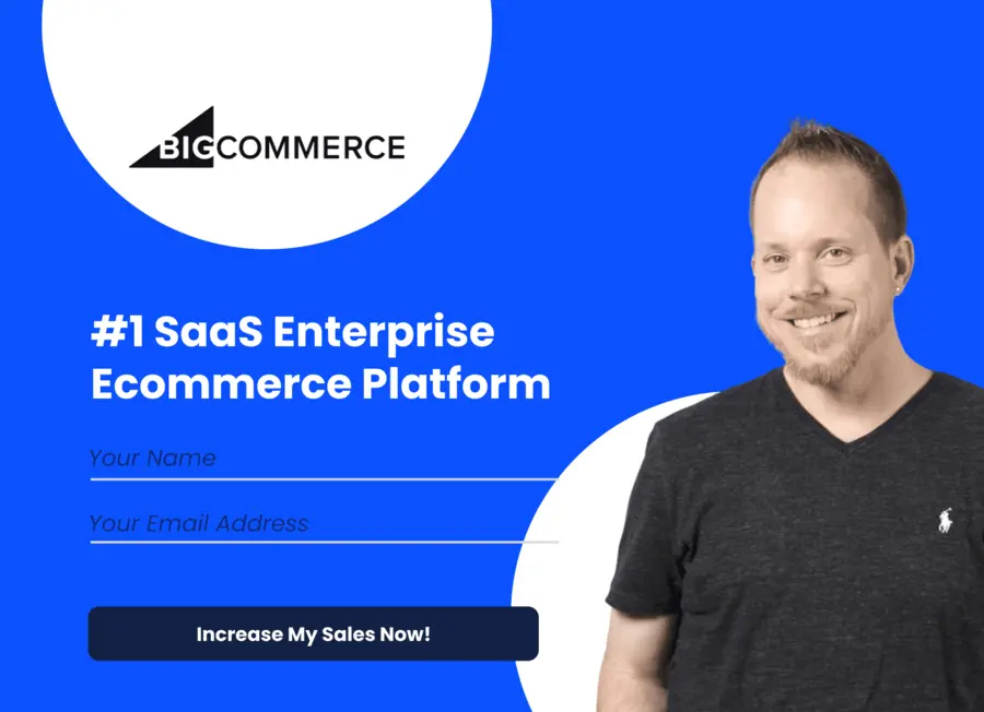
What is A Landing Page?
A landing page is an action-oriented page on your website which is meant to drive conversions. The single focus of any landing page is to get visitors to take the desired action.
Usually, visitors end up on a landing page after clicking on a Google AdWords ad or something similar.
Many webmasters often confuse landing pages with a homepage.
What’s the difference?
There is a stark difference between the two of them. You can think of your homepage as a gateway to the other sections of your site. The homepage is not built with a specific purpose.
On the other hand, a landing page is designed and optimized to boost the conversion rate. Through sign-ins, discounts, and other such strategies, landing pages strive to show tangible results.
Want to create a landing page for your ecommerce brand?
Let’s learn how you can do that.
What Makes a Good Ecommerce Landing Page?
For higher conversions, you need to design your ecommerce landing pages strategically.
Here are some things you need to keep in mind while creating an ecommerce landing page:
1. Make Your Call-to-Action Buttons Prominent
The most crucial element of any landing page is the call-to-action (CTA) button.
And why so?
It nudges your visitors to complete a particular action that you want them to take. So, it’s essential that your CTAs are easily noticeable.
How can you ensure that?
Place them in the center or top of your page. You can also add it above the fold. That way, it’s hard to miss the CTA on your landing page.
Clever, isn’t it?
Another way to draw attention to your CTA is by changing the color of the button. Pick a color that is in contrast with the color of your landing page. Doing this will make your CTA pop out.
So, how does a good CTA button look like?
Take a look at AYR’s landing page. They’ve decided to make the CTA the focus of their page. Since the background of the landing page already has multiple colors, a translucent white box works well to accentuate the CTA.

Image via AYR
Note how they have also highlighted the “Yes, Please” option to make it stand out.
However, do not copy their CTA design blindly. Find something that works for your website design.
Want to find out which CTA can work best for you?
You can use A/B testing to get an answer.
2. Get Rid of Distractions
You may want to tell your customers about all your new products, discounts, and offers at once. After all, you need to get their attention.
However, adding too many elements on your ecommerce landing page can be counterproductive. If you show too many offers on a single landing page, you may end up confusing your visitors.
Makes sense, right?
So what should you do?
Before you design your landing page, be clear about what your goal is. Do you want to tell your visitors about your new product? Alternatively, do you want them to subscribe to your newsletters?
Whatever it is, focus on only one goal. For other purposes, you can always design other landing pages.
Do you want to see an example of a great landing page?
Here it is:
Lyft landing page is minimalistic, neat, and focuses on getting their visitors to sign-up. It’s easy on the eye because there aren’t too many elements on the page.

Image via Lyft
3. Use Good Visuals
If you’re trying to sell a product, showcase it well. Use high-quality images that show your visitors why your product is valuable.
Don’t shy away from getting creative with visuals.
How can you do that?
Place your product in different lights. Try to place it in a broader context to give your customers a better feel of the product.
For example:
FabFitFun uses this strategy on their ecommerce landing pages often.

Image via FabFitFun
How can anyone resist clicking the pop pink CTA nestled there?
In the above picture, you can see how they have laid out the box’s content. Not only do they add a visual appeal but they also showcase what the visitors can expect from the box.
4. Write Catchy Headings
Use the power of words to evoke curiosity in your visitors. A well-written heading can win over your visitors.
However, that doesn’t mean you need to try too hard to impress. Avoid using wordy sentences or fancy words. The first rule to writing a catchy heading is to keep it simple.
One of the first things that visitors will notice on your landing page is your heading. A well-written headline can win them over and get them more interested in your products.
Don’t believe me?
Evernote’s headline is quite straightforward. It conveys what their brand can do for the customer effectively in just five words. It’s effective and, at the same time, it’s catchy.

Image via Evernote
5. Use More Videos
Videos can be an asset to your landing pages.
How?
Videos are visually-impressive, engaging, and can highlight the best features of your products.
What type of videos should you create?
Depending on your brand’s voice, you can craft something sophisticated or humorous. Keep in mind your target audience and how they communicate.
Both types of videos can work well if they are created strategically.
EyeView conducted a study to understand the relation between videos and lead generation. They added a video that would allow autoplay on TutorVista’s landing page. They kept track of the number of conversions they received after adding the video.

Image via EyeView
The result?
The conversion rate of the landing page with the video was found to be 86% higher than the regular landing page.
Impressive, isn’t it?
In the ecommerce industry, you can also experiment with the kind of videos you are uploading. From product reviews to tutorials and advertisements, you can try it all. There is plenty of room for creativity.
And the best part?
You can use the same videos to engage more people by sharing them on your social media feeds as well.
6. Try A/B Testing
You may think you’ve designed the best possible landing page. But then it doesn’t give you the desired results.
What went wrong?
You need to analyze your landing page to find out what's not working. That’s where A/B testing comes in.
You need to create two versions of your ecommerce landing page. And you can change even small details like changing the color scheme or use two different versions.
You need to compare the conversion rates of these two versions to find out which design works better for you.
A/B testing can also help your business generate leads.
Do you need an example to understand this better?
Wall Monkey, an ecommerce business that provides decals, saw their conversion rates increasing by 27% with A/B testing.

Image via CrazyEgg
With this little experiment, they realized that A/B testing is the key to generate more leads. So, they decided to use it again.
And, you know what?
This time, they saw an increase of 550% in their conversion rates.
Unbelievable, right?
They achieved this by keeping an eye on user behavior. Based on what the visitors were responding to, they changed their landing page.
7. Add Reviews
Adding social proof to your ecommerce landing page can provide credibility to your products.
You can add testimonials, quotes, or even reviews.
Do you think that I’m exaggerating?
According to a study by Amasty, the more reviews you add, the better chances you’ll have of improving your conversion rate. That’s because most people want to know if a product is as good as it seems on the site.
Sounds sensible, right?

Image via Amasty
Another study by Power Reviews found that 97% of consumers read reviews before they make a purchase. Further, 89% of consumers considered online reviews to be an important resource in online shopping.
Of course, you are bound to get some bad reviews as well. But don’t try to polish your image by removing the negative reviews. Customers are smart and can quickly figure out if the reviews seem too good to be true.
In fact, negative reviews can be good for you to provide a more nuanced perspective about the product.
Do you think I’m kidding?
The previously cited study showed that 85% of consumers seek out negative reviews to make a more informed buying decision. Among the age group of 18-29, this number increases to 91%.
Consumers want to see negative reviews so that they can picture the worst-case scenario if they buy your product. Based on that, they tend to weigh if there is enough value in buying your product.
The bottom line?
If you want to build trust, you need to keep your reviews section realistic.
8. Offer Discounts
Offering discounts is a sure shot way to entice your visitors to buy your product. For many people, a sweet deal is hard to resist.
You can offer discount to encourage your visitors to click on your calls-to-action. Many people have a hard time resisting a deal.
Discounts can also help you show your unique value proposition. You could show the original price of the product, then compare it with the discounted price.
Corkscrew Wine Merchants changed some minor details on their landing page to highlight a discount and were able to increase their sales life by 148.3%.

Image via Ready Cloud CRM
Can you believe that?
Such a tiny update on their landing page made a huge difference. Of course, for this strategy to work, there are others that you also need to consider.
A clean design is your best friend to get a good discount noticed quickly. Clever wording can be an added advantage.
9. Add a Zoom Feature
Most ecommerce websites add a zoom feature to only the product pages. But adding it to your landing page can also be a great strategy.
What difference can the zoom feature make?
With a zoom feature, you can help your potential buyers view your product from different angles. It also adds a bit of interactivity to your landing page.
You can use tools like Cloud Zoom or Magneto Zoom to add the zoom feature to your product images. Some of these tools also allow a spin feature.
The Magic 360 feature of Magic Toolbox offers a spin and zoom feature which allows your visitors to enlarge and rotate a view of your products:

Image via Magic 360
Igor Varyvoda, a Digital Strategist from Magic Toolbox says that the zoom feature may even have a positive effect on conversion rates.
Is that so, you may ask?
“As told by our users, going from a small static image to multiple big images with Magic Zoom Plus has a positive effect on conversion rate. I estimate the improvement is between 2% and 40% depending on what product images were like beforehand,” Varyvoda said.
The zoom and spin feature allow consumers to see the finer details of your product. This can help them in their decision-making process.
10. Add Product Categories
Product categories are usually associated with the homepage. But you can also add them to your landing page.
Want an example?
Bold Commerce used this strategy for their landing page on Black Friday.
They had a lot of deals to offer but they didn’t want to showcase them all at once. So, they organized them into different product categories.

Image via Bold Commerce
How did it help?
With this sort of compartmentalization, it’s easier to navigate. It gives visitors an option to find a deal that they are more likely to be interested in.
Are you concerned about crowding your landing page?
Pro tip: Create ample blank space between the categories to give it a neater look.
For example:
Check out how Baby Gap has designed their landing page. Since they already have too many buttons, they have stayed away from adding any visuals. This makes it look very clutter-free.

Image via Gap
11. Provide All the Necessary Pricing Information
Such a tip cannot be applied to non-sales landing pages (like downloads or sign-ups). On the contrary, if you directly sell products, you need to include the pricing information. Actually, it is incredibly beneficial.
But, how?
Obviously, people want to know the price before making their purchase. What happens if they are not sure? They start to doubt. And that anxiety can easily make them leave your ecommerce landing page.
Ask yourself a question: Will you be ready to commit a purchase without knowing how much it costs you?
No one wants to buy something obscure and hidden. For this reason, make certain to show the pricing details of your products and offers. This can help you to increase the number of conversions.
As an example, this is exactly what Lintense does. Just a glance and people can see the price of the headphones. This helps make people feel more comfortable.
And, you know what?
And, according to Klientboost, including your price on your landing page can improve your conversion rate by over 100%.

Conclusion
Your ecommerce landing page needs to stand out to boost conversions and generate leads. This is easier said than done.
From adding catchy headings to prominent CTAs, there is a lot to take care of. You could add in a zoom feature and product reviews to add more credibility to your landing page.
Designing a good landing page isn’t only about aesthetics though. You need to strategize and analyze to see what works for you. There is no one size-fits-all approach for it.
Have we missed any of the best examples of ecommerce landing pages? Please share your views in the comments section below.

Related Articles
11 Best Ecommerce Platforms to Set Up an Online Store
Top B2B Ecommerce Platforms for 2024
How to Build an Ecommerce Website in 9 Easy Steps
11 Best Ecommerce Platforms for Small Businesses in 2024
The World’s Top Ecommerce Companies (2024 List)
25 Best Ecommerce Tools to Grow Your Business in 2024